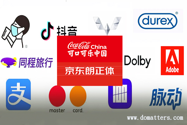
The time of 2020 is about to pass half in a flash, how is your business going? Although the business in the world was affected by the epidemic in the first half of the year, it seems that the enthusiasm of companies and brands has not diminished. Famous brands including Alipay, Meizu, Durex, Adobe and others have upgraded their LOGO. In this article, Domatters analyzed their five major design trends according to the actual situation.
Trend one: the colors are more vivid
Alipay has replaced the new icon design this year. Compared with the extremely detailed styling changes of the word “支zhi”, we have paid more attention to the color of the LOGO. Alipay retains the blue hue, but the blue color of the new LOGO is significantly more eye-catching.
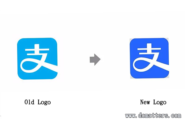
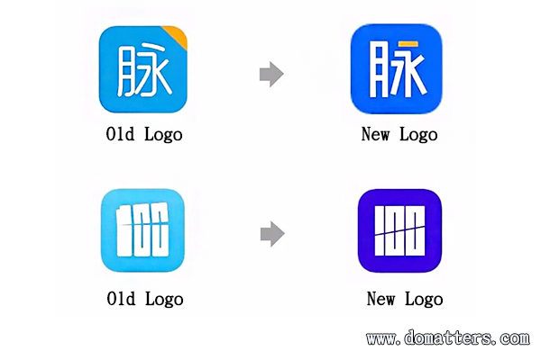
During the upgrade process of many LOGOs, the colors are changing in a more vivid direction. For example, Maimai’s new logo uses almost the same color changes as Alipay.
There is also Baicizhan that just changed LOGO this year. Although the new image “cut” is only promise, but the color is much tougher.
Trend two, positive and negative swap
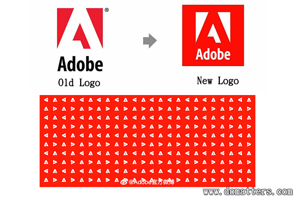
In addition to the bright colors of Adobe’s LOGO, the main change of Adobe’s LOGO is that the letter “A” changes from white to red, and the positive and negative signs of the logo are also reversed.
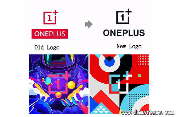
This is not the only Adobe brand. For example, you will find the LOGO of OnePlus mobile phone, and the English part of it has also been reversed.
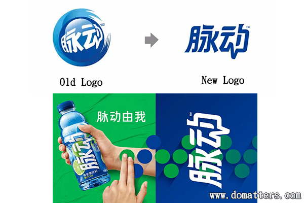
There is also the LOGO of Maidong, which is also positive and negative. It boldly discarded the original ball shape with more memory points and turned it into a plain text LOGO.
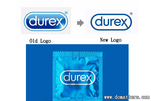
In the same way, Durex’s new LOGO also uses the positive and negative shape swapping upgrade method, which is definitely the most popular LOGO upgrade method in 2020.
Trend three, logo comes with font
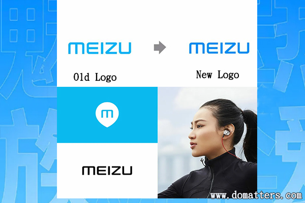
Obviously Meizu’s LOGO upgrade is in line with the first trend Domatters said today, and the colors are more vivid. In addition, Meizu brand upgrade also released a set of brand fonts, and also supports multiple languages, which can be said to work very hard.
After Tencent released the Tencent brand font in 17 years, more and more big brands have also explored how to shape their own brand image through fonts. Coca-Cola also released the Chinese brand font “Care for fonts”. In 2019, Alibaba gave birth to PuHuiTi which is a free commercial font. In the past year, Jingdong font, OPPO font and so on were born.
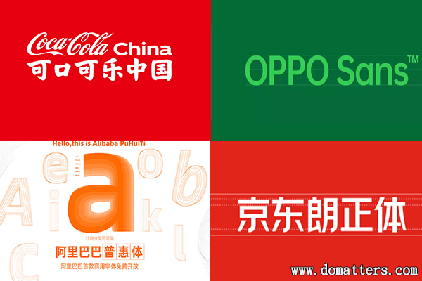
Coca-Cola China Alibaba PuHuiTi OPPO Sans font JD Long Body
Trend Four: Respond to changes with no change
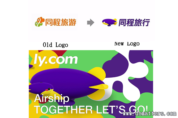
Perhaps it was affected by the new crown epidemic situation, or it may be that Party A’s consciousness has improved (of course this is impossible). In short, the overall change in LOGO in the first half of this year is very small. They basically retain the original visual hammer. This year, there are also new ones like Tongcheng Travel’s new logo, which seem to have changed a lot. Of course, it has also received a lot of 1 star bad reviews.
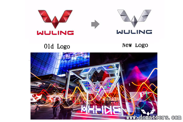
Like Wuling Hongguang’s LOGO, it also issued T-shirts, and had an offline brand conference. The new LOGO was also made colorful by the lights. As a result, it just changed to a gray LOGO, and the shape did not change at all.
Douyin’s LOGO has also changed this year, but it doesn’t seem to cause any waves. Just because the change is too small, for ordinary people, there is actually no change.
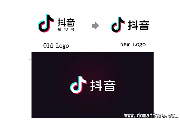
There are many such examples this year.Brand owners are protecting their brand assets so that they can change constantly.
Trend V. LOGO direct marketing
2020 is an extraordinary year, with various events one after another. Creative posters and other past expressions appear to be lagging behind. This year, LOGO is often used directly for creativity. For example, the LOGO of the Olympic rings was “isolated” by netizens.
MasterCard, which has only two circles, has not escaped the ridicule of the designer, and it has also been isolated.
Nokia’s classic handshake logo has also become reduced contact and distance.
Xi tea’s LOGO put on a mask.
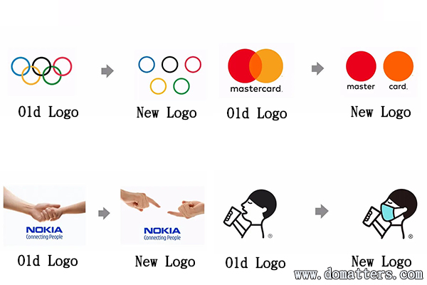
Using LOGO to directly “do things” is not a patent this year, but in 2020, the method used by LOGO is more flexible and changeable. After all, LOGO itself can represent its own brand. Many creative posters are impressive, but the brand behind him is unknown. And LOGO direct creative marketing solves this embarrassing problem.
These are the five major trends of LOGO changes in 2020 that Domatters analyzed based on the actual situation of market changes. What do you think is the trend of LOGO changes now? Welcome to leave a message to discuss.
Note: The pictures in the article come from the Internet, and the copyright belongs to each brand.


